Thursday, January 29, 2009

Today's challenge on SCS for Ways to Use it was to use our alcohol inks to create. I have a limited supply of copics, and only 4 alcohol based re-inkers, so the choice wasn't as daunting as some. I didn't have too much to think about.
I created a faux polished stone look on glossy white with some stream and a wild plum inks then taking some off with the alcohol blending solution. I received the image through the Pay It Forward thread on SCS and distressed it a bit after crumpling it up. I also had a ghost flower image that I used the same polished stone technique with the same colors. I added some clear embossing powder to the flower and while warm, molded the petals to make it a bit 3D. I don't have any purple brads, so I took a copper one and added some purple embossing powder which gave the brad a bit of a purple metallic sheen.
I think I'm going to head out to my local scrapbook store for some more natural inks to try it again.
Thanks for popping by.

Wednesday, January 28, 2009

Only had time for one today

This card is for the SCS sketch challenge. It's actually upended, but followed the same parameters.
I wanted to use this mouse cuz I have to send out a few birthday cards, so I wanted to keep it a little simple. I used 2 panels that I had embossed with the cuttlebug, one in paisly and one in swiss dots. I sponged saffron over the paisley and real red over the swiss dots. The image was colored ... Wait for it ... Yes, with colored pencils and gamsol, lol. I added some glossy accents to the party hat circles as well as the eyes of the mouse. I think I may have taken the pic while the glossy accents was still wet, but as I look at it now, it's perfect ... His eyes look almost real. And if he weren't so danged cute, I might have to throw this one away.
Thanks for looking ... I'm hoping to post some more tomorrow.
Take care and have a wonderful rest of the day.

I was all over the Place Last Night

Omygosh, I went on a challenge hunt last night ... Sometimes insomnia is fun ... other times it drags you down ... Apparently I was having fun last night because I came up with 5 cards from various different challenges across the web.

This first one was for the House Mouse challenge found over at their challenge blog. This week it was to use piercing on the card. I actually just had a bowl of popcorn so this stamp was the first one that came to mind, so I had to work around it.
After coloring with my colored pencils and gamsol, I added glossy accents to the silver/chrome part of the stove and the ring on the pan handle. I tried to get the color of the electric burner just right, but still needs a smidge of red to it. I'm liking how it turned out, regardless. Hope you do too.

For this card, I searched the Mojo Monday blog and found this sketch. It's actually a mirror of the sketch that was up, but Michelle's balloons kept getting in the way, so I just flipped it over. This is one of the newer stamps released through the Whiff of Joy site called Michelle Celebrating Donkey. I tried to bring in mats for the layers that would coordinate with the dots on the dp, hence the navy, ruby and tangerine colors. Fun, festive card.

I made this card after having been inspired by the website of http://www.iheart2stamp.com/, to send cards to Dallas Baptist College that foreign students can send out. I had just gotten this image in from Whiff of Joy (my new favorite supplier cuz they have Elisabeth Bell!) so I had to make it work for the challenge. They're looking for mostly blank note card types of cards. I just found out about it Tuesday, and the deadline is the 31st, so if you see this and are interested in HUGE blog candy ... take a peek at the above website.
I cut out a heart shape from the DP and layered this over the image panel that I had sponged. On top of the DP, I laid a piece of white that I punched on one side with a MS border lacy punch. Looked a little stark, so I actually drew some vertical lines in a pale pink and gamsoled it to soften the line up a little ... Looks like pleats to me. This one is a very pretty one in real life.

This card is one of I hope 9 ... I'm going to try to get all the sketch challenges done from the Tayloered Expressions blog. This one was the sketch by Taylor Vanbruggen. Like I said, I'm hoping for 8 more before Saturday. I like the wide oval with embellishments at the opposite ends.
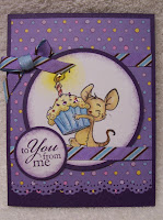
This card was for the Whiff of Joy challenge found at www.wojmondaychallenge.blogspot.com. While their layout was square, I didn't think it was taking too much license to make mine the standard size as long as I was faithful to the layout. I used my colored pencils and gamsol to color him in (I know, you're SHOCKED and AMAZED, lol) ... I did add some stickles in fruit punch, baby blue, lavendar and diamond for the confetti on the icing. I used 2 different sized circle punch masks to creat the glow on the candle (larger with banana, smaller with summer sun) then added some glossy affects to the heart of the flame. I got this ribbon last year from a Secret Sister and thought this was a perfect fit - colors looked good with the DP ... and I liked the stripes against the polka dots. Another fun one.
Thanks for stopping by and taking a look.
Have a great day!
This first card was for the new Wish RAK Blog Featured Stamper challenge, week 3 - Don't know if I've said it yet, but Stacy has a wonderful style. I love her cards (and her stamps even more). She has all the stamps that I want (or at least want images of), ranging from her incredible vintage stamps to the House Mice ... Incredible is about all I can say. (I digress) Anyway ... Her card was set the other way with the ribbons going up the left side, but I liked it so much that I used the layout here for this cute Moose in Love. I'm thinking I may have to get this image for myself - it's just too cute, and fairly versatile - as long as you use it with love, lol.


This card here was made in accordance with the TLC205 challenge, to use pleats. I took a sheet of daisy dp and fan-folded it then trimmed it so it would fit on this piece of chocolate card stock. Folding it lost some of the imagery, so I took some Tim Holtz tea dye ink and sponged it over the pleats to emphasize them a little bit more. I also took a flourish stamp, with tea dye, and stamped an image over the pleats. This was alot of fun ... Easier to do it with a thinner paper, tho, so be forewarned.


This card was made for the color challenge for Tuesday, January 27th: pacific point, baja breeze and garden green. I stamped the image from Upsy Daisy in baja then slight moved and stamped in pacific point to give it a shadow effect. I cut it with the Nesties Label One die and cut a pacific point mat. For the green, I cut a thin strip (about 1-1/4 inch) of garden green and punched both sides with a MS border punch that I lined up on the opposite side. I really like the pearls going across the bottom. Think they add just the right flair.
Thank you for stopping by. I always love your comments.
I followed the SCS sketch challenge LSC204 to make a card with a predominantly black backdrop. I have a pink pirouette base but took a mat of black and clear embossed this same flourish as you see as the main image. When I started this card, was going to be a red and black card ... I stamped the image in red and messed up a little (twice) in the embossing, so when I went for it a 3rd time, I wanted to use versamark, but I forgot to clean off the image, so I ended up with a pretty pink, that went perfect with the pink pirouette, so I just clear embossed over that ... I'm really quite happy with the results. I tied a bow at one corner and just a knot so it wasn't too busy at the other corner with some ribbon I found at Walmart. I love this set, I just keep forgetting I have it to use.
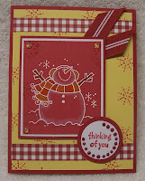
This card was for the Inspiration challenge. We were to find inspiration from Lang calendars. I found a folksy, country calendar with predominantly red backgrounds and very country edges. I didn't want to color my entire snowman in, so I picked this warm and cold snowman from Penny Black and stamped him on ruby red. I triple matted the image and added some stickles and slight coloring with my colored pencils and gamsol.
I made the background paper out of saffron by stamping in red some images from the Stampin Up snowburst set then adding the red gingham strips of paper to simulate ribbon.

This card was made after I cased Vicky Gould's gallery ... Let me tell you, this was no small feat. She's got some lovely cards to look at, but I settled on this image from Stampin Up's Provencal set because it's got the look of a collaged image already. The card I cased from her had the same layout, only I flipped mine on it's side to allow for the image. I used gamsol and my colored pencils to color, and am actually quite excited at the way the clouds turned out ... I do so love the vintage, collaged cards ... I should probably do more of them.
This card was done for All That Scraps challenge - to use faux stitching. I pierced the paper then dragged a rose red Zig marker from dot to dot to simulate the stitching. This Rope Swing image is from Sugar Nellies - an Elisabeth Bell creation.

This card was made for the Ways to Use it challenge WT202 at SCS - Pizzazz up your background paper. I took a butterfly stamp and white embossed all over the DP to create a 3D BG paper. I love this Claudia the Artist stamp I got ... it's another Elisabeth Bell image I got through the Sugar Nellies line at Funky Kits in the UK.

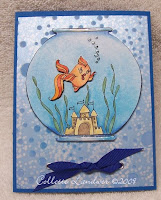
This Sushi card was done just for fun. I colored the fish bowl by sponging 3 different blues, getting darker at the bottom. I drew in the seaweed and colored the rest with prismas and gamsol. The bubble paper came as is with flocking where the bubbles are. I colored another fish and cut him out, popping up on dimensionals.
Thanks for stopping by ... Enjoy your day.
This mouse was done for a sketch challenge a couple of weeks ago at Splitcoaststamers, SC211. The image is from Sugar Nellies (funkykits out of the UK). He looks vintage, so I used some old dollhouse wallpaper as my DP. While the card looks good to me IRL, I think from the picture, I could have made the flowers a little bit bigger.


These next two cards follows last week's sketch challenge, but also the color challenge CC202: combine burgundy, regal rose and kiwi kiss in the card. We're still in a deep freeze here, so felt the skating Mudzie was perfect. I added dew drops to Mudzie and some fruit punch stickles to the Rachel Anne Miller card.


Thanks for looking and have a great day!

Tuesday, January 20, 2009

This card was for the SCS color challenge today: combine Regal Rose, Burgundy and Kiwi Kiss. I received this image through the Wish RAK over at SCS. It's freezing again today, so thought this was appropriate. I colored Ike with prismas and gamsol and used some rose red ink with the blender pen for his ear muffs.
I combined the SCS color challenge with the Mojo Monday challenge #70 sketch challenge that you can find here: http://mojomonday.blogspot.com/. While my image isn't square, it's in the same spot, so I hope it works.
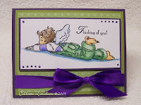
This card was made for the Whiff of Joy challenge #14 that you can find here: http://wojmondaychallenge.blogspot.com/. The challenge was simply to use purple and green - which is one of my favorite combinations (especially plum and olive) ... but I wanted a richer purple, so I went with the eggplant and olive combination for this card. Even colored Matthew's clothes in purple and green.
Thanks for coming in and taking a peek.

Monday, January 19, 2009

The challenge for today's SCS Technique Lovers was to make a faux mosaic card. I used strips of tacky tape cuz I don't have the sheets. (I recommend buying at least ONE sheet just in case this pops up again, it was tedious work laying the strips side by side to ensure there were no gaps). On top of this, I took some designer paper that I had cut up into my 'mosaic tiles' then positioned on the tacky tape. I wanted a darker 'grout' line, so I used an embossing powder called "cloissone" which had a purply verdigris (spelling?) color to it when heated. I did this 3 times to give the 'grout' line a thicker, darker impression. I had to fit in my newest Sugar Nellie somehow, so I added her as my focal image.
Thanks again for stopping by.
I was busy this weekend, see previous post, so I didn't get a chance to do all the VSN Crush Challenges, but since I'm one of the hostesses for the February 20-21 Challenges, we got a sneak peek, so I was able to make some of the cards ... These are the ones I was able to finish and upload.
This was my "Save the Date" card.
I made it rather generic since I didn't have anything particular in mind that I wanted to use it
for. (Okay, now I can think of a ga-zillion, lol). I really liked the way the colors look together - the saffron sponged with burgundy, on the burgundy mats just looked perfect with the flowers I picked.

The next challenge was a technique challenge: Burned Batik. I embossed in clear EP on white cardstock the floral image you see as the main image. I heat embossed it just a smidge past "done". (This was take-4 ... initially instructions were to heat it until it soaked through the cardstock, but I found that by heating it that long, the embossing powder nearly dissolved so the effect was lost.) ANYway ... after embossing, I misted the cardstock fairly well and then took some pink pirouette on a sponge, dabbing it here & there. Did the same for riding hood red until I got this batik effect. WONDERFUL technique - I love love love it. I received the ribbon through the SCS Wish trade. I may have to break down and buy my own supply, lol.

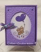
This next challenge was "Love me Tender" - use something soft on the card. My immediate thought was flocking - well, I only have this purple flocking, so the card was built around the flocking. Once colored, I added the flocking on top of 2-way glue & let it dry. On top of the image panel is an oval framed I cut and then CB'd with the swirl embossing folder, then matted up on dimensionals to give it a shadow box feel.

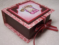
The next challenge was to make a Hope Chest-type of box. I had just finished this origami box last week on SCS's TLC challenge and wanted to 'perfect it'. I just loved the idea of using the Bella Rose DP from Stampin' Up. This pairing reminded me of chocolate covered cherries.

I just LOVE the way it turned out. I was trying to make the box the other day from memory, at cheerleading practice and one of the coaches daughters fell in love with it (crude and rudimentary, tho it was) ... so I told her I could do WAY better than that (no paper cutter to make sure it was square, no pampered chef scraper to crease the folds, no design on top) ... So this is for Haley's Treasures.
This was the 5th challenge:
Something OLD
Something NEW
Something BORROWED (or gifted)
Something BLUE

One of my stamping buddies has another buddy (7 degrees of stamping) ... Anyway, this technique used Teykol. I had to order some all the way from Europe. It's a white liquid paste type of product that acts much the same way as embossing resist or white crayon resist. I poured a little bit of my NEW Teykol on a small paper plate and stamped an OLD butterfly image in the Teykol liquid then stamped over a glossy cardstock that was also recommended that I got from the same company. It's similar to the SU glossy white, only super thick and glossy on both sides. I set the images aside to let dry and came back to sponge some pink, blue and light green across the surface. My BORROWED was the flowers - they were gifted to me by my Secret Santa last month. And as for the BLUE - well, that's an easy one, right?
If you're interested in checking out this technique, this is the website I ordered from, but it's not in English. I'm not sure if it's Germany or Norway or where, but if you're good at visuals, they have a tutorial on how to use this products 3 different ways here: http://www.art-journey.nl/shop/ - click on "Techneiken", then "Techneikenrubriek 2" then scroll down to Teykol. VERY cool. Thanks again to Kim (SCS: Luvs Flowers) and Christiana for the ideas.

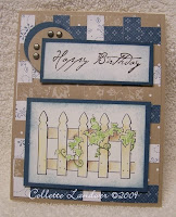
This last one involved weaving ... I had just grand ideas in mind for this, but since I was taping as I went along, I ended up with a stripe of kraft and a stripe of not quite navy that I couldn't take out and re-weave.
The entire DP is woven DP's from a paper pack - I think the colors are not quite navy and kraft, but they weren't marked. I think next time I try this, it'll be with re-positionable tape so I can get a good pattern going.

This 'card' was from Friday night, a Scrapling, for the flirtation challenge over on VSN at SCS. Apparently, some people, when asked to make a square card, cut off the strip at the end of a regular sized card and have this wasted piece left over (ME? I just bump it up to a 5.5x5.5 card) ... SO ... I had to make my own wasted piece, lol.

Thanks again, for stopping by ... Appreciate any comments.

Sunday, January 18, 2009

After 2 days of competition - The girls took first place ... Great job girls - Wonderful work. That's my munchkin up top. Super proud of all of you, especially my little gem, of course, right?
Well, we're finally starting to warm up ... it was a balmy 14 degrees on our way home tonight. Sure beats the -25 from a couple of nights ago.
After having what seemed like no weekend, I'm so glad we have tomorrow off.
Take care & stay warm !

Monday, January 12, 2009

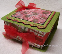
I've never tried this before, but today's SCS challenge for Trying a New Technique was to create an origami box ... and here's the results. The lid is just a flap that runs from underneath, up the back and rests on the top. Ribbons on my box are entirely decorative ... Some of the ladies in the gallery used ribbons to tie the box closed - I even saw one of them that fashioned a strap with a magnetic closure. I can't wait to run to the store tomorrow to buy some Fanny Mae chocolates to make a 2-decker candy box for someone special ... now who deserves this?

Thanks for sneaking a peek.
Worked on a couple of cards this morning, following MojoMonday sketches 68 and 69 that can be found here: http://mojomonday.blogspot.com/
For #68, I used my Unity So and So Loves image that I colored with my prisma colored pencils and gamsol. Just the right amount of hearts on it, lol.
MOJO 68


The second card, for 69, I stamped a Sugar Nellie called Daisy, designed by Elisabeth Bell. She is one amazing artist, that's for sure. I think I love every image I've seen. Make sure you check out the Whiff of Joy website ... they're offering a pre-order Spring Stamp Kit of 10 stamps all designed by Elisabeth Bell - 'nuff said for me ... I'm all over that!

MOJO 69

Don't forget to slide on over to Whiff of Joy .... http://www.shop.whiffofjoy.com/index.php?cat=c12_Stamp-kit.html

Thanks for stopping by ...

Whiff of Joy Challenge #13:

Here's the card I made ... After taking the picture, I realize I missed the boat on the corner embellishments. Even without, I like how this card turned out.

Thanks for taking a peek at my late night creating.